What is the suggested strategy to MOs on gear? And how do you handle mana ? I just 100, equipped the big game hunter set and I'm really hurting on mana, chugging pots constantly, especially on boss fights.
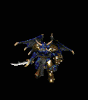
Overkill Throw Barb

I loved Overkill ever since the olden days - great to see a guide for sigma  thank you
What is the suggested strategy to MOs on gear? And how do you handle mana ? I just 100, equipped the big game hunter set and I'm really hurting on mana, chugging pots constantly, especially on boss fights.
What is the suggested strategy to MOs on gear? And how do you handle mana ? I just 100, equipped the big game hunter set and I'm really hurting on mana, chugging pots constantly, especially on boss fights.
Legendary Posting Badge
Posted over 10.000 messages
Legendary Popularity Badge
Has a thread with over 250.000 views
Great Supporter Badge
Donated 5 times
Legendary Contribution Badge
Median XL Team Member
Great Special Badge
Legend.
Mana leech mos on weapon until you get the first easy charms with life/mana leech on them. Attack speed, fhr, enhanced defense, etc..You can get some ideas from Aerial's Tldr guide too. You can hit good breakpoints with runes in all slots too.
I don't mean to dwell...but I can't help myself.
1) Can someone tell me what they are using in all the sockets
2) How do you keep Titan Strike up as a ranged character?
3) Does 750k-1million defense refer to Titan Strike + standing next to wolf?
Right now, I have "Jah" in the weapon and "Lum" everywhere else.
2) How do you keep Titan Strike up as a ranged character?
3) Does 750k-1million defense refer to Titan Strike + standing next to wolf?
Right now, I have "Jah" in the weapon and "Lum" everywhere else.

Running this build and I'm really enjoying it so thanks for the guide! I do have a question about mana: I run low, especially on bosses, is there something you use to over come this? I currently have 5% mana leech on my ring. I even put 25% mana regen on both rings and my ammy. Should I be MOing mana regen or do I just need more mana leech?
nice guide. Quick question, what do you do as your mana regen/leech/on attack source? from items? MO? or just mana regen rune (Sur?) Thanks.
I am just having some issue keeping up with super maxed overkill skill
I am just having some issue keeping up with super maxed overkill skill

Great Posting Badge
Posted over 2.500 messages
Legendary Popularity Badge
Has a thread with over 250.000 views
Common Supporter Badge
Donated 1 time
Common Guide Badge
Created a complete character guide
While the Pro's /Con's are better readable now, the uber section still lacks something. For example when I scroll down, I can't exactly pinpoint the Triune uber in an instant. The key notes like that have to be easily visible to make the reading for the other people a lot easier. Always remember that people following a guide don't just read it once. No, they regularly come back to continue reading when they are stuck somewhere, so making important information like that easily accessible makes a guide go from bad to good.
Just changing the color for the uber names would already be really helpful so people following this guide won't have to re-read the whole wall of text just to find out information about a single uber. You could also change the size of the uber names so it's even easier to see, or seperate the ubers, or use the horizontal ruler:
in order to clearly seperate sections from each other.